<!DOCTYPE html><htmllang="ko"><head><metacharset="utf-8"/><title>반응형 홈페이지 만들기 01</title><!-- 검색엔진을 위한 내용 --><metaname="description"content="반응형 페이지"/><!-- 구글같은 경우 키워드를 마음대로 쓰는 경우가 많아 이 키워드로 검색이 안되는 경우도 있음--><metaname="keywords"content="homepage, 홈페이지, 반응형, 따라하기"/><metaname="author"content="Gibson Kim"/><!-- viewport: 다양한 디바이스에서 페이지를 보여줄 때 어느정도 해상도가 알맞는지를 세팅하는건데
결과적으로는 device width가 최적이므로 그값으로 세팅을 한다.
scalable은 확대 축소에 대한 내용으로 변경시 페이지 출력이 깨지는 경우가 있기에
변경이 불가능하게 세팅을 한다.
maximun-scale/minimum-scale 설정은 user-scalable 을 사용하지 않는 디바이스를 위해 세팅--><metaname="viewport"content="width=device-width, user-scalable=no, initial-scale=1.0, maximum-scale=1.0, minimum-scale=1.0"/><!-- 인터넷 익스플로러가 화면 렌더링에 문제가 생기는 경우가 있어 최신 렌더링 엔진을 사용하라는 세팅값--><metahttp-equiv="X-UA-Compatible"content="ie=edge"/><!--사이트 공유하기 : 페이스북 등을 보면 사이트 정보가 틀에 맞춰 보여지는 경우가 있는데 그렇게 나오게끔 세팅하기
Open Graph (Facebook, Linkedin)
https://ourcodeworld.com/public-media/articles/articleocw-56d1a6901b773.png --><metaproperty="og:type"content="website"/><!-- 위의 타입은 이 사이트에서 확인이 가능함 : https://ogp.me/#types --><metaproperty="og:title"content="반응형페이지 만들기"/><metaproperty="og:description"content="반응형 페이지 만드는 법 무작정 따라하기"/><metaproperty="og:image"content="https://gibson1211.github.io/assets/images/gibson_logo_square.jpg"/><metaproperty="og:url"content="https://gibson1211.github.io/"/><metaproperty="og:site_name"content="Gibson's Blog"/><!-- 트위터는 twitter card라는 형식을 따라야 함.--><metaname="twitter:card"content="summary"/><!-- card 종류: summary, photo, player --><metaname="twitter:title"content="반응형페이지 만들기"/><metaname="twitter:description"content="반응형 페이지 만드는 법 무작정 따라하기"/><metaname="twitter:image"content="https://gibson1211.github.io/assets/images/gibson_logo_square.jpg"/><metaname="twitter:url"content="https://gibson1211.github.io/"/><metaname="twitter:creator"content="Gibson Kim"/><!-- 일반적인 fabicon 설정 --><linkrel="icon"href="https://github.com/Gibson1211/Gibson1211.github.io/blob/master/assets/images/favicon.ico"/><!-- 아이폰용 fabicon 설정 --><linkrel="apple-touch-icon"href="https://github.com/Gibson1211/Gibson1211.github.io/blob/master/assets/images/favicon.ico"/><!-- 인터넷 익스플로어용 fabicon 설정 --><linkrel="shortcut icon"tyle="image/x-icon"href="https://github.com/Gibson1211/Gibson1211.github.io/blob/master/assets/images/favicon.ico"/><!-- CSS Reset : CSS Reset은 최상단에 적용해야 reset이 정상적으로 이뤄진다.
normalize 사이트는 계속 업데이트되므로 이런 경우를 대비하여 normalize 파일을 다운받아
css 폴더 내에 추가하여 사용할 수 도 있다. --><linkrel="stylesheet"href="https://cdnjs.cloudflare.com/ajax/libs/normalize/8.0.1/normalize.min.css"/><!-- 아이콘을 많이 사용할 때 많이 사용하는 사이트 : https://fontawesome.com/start --><script src="https://kit.fontawesome.com/f1def33959.js"crossorigin="anonymous"></script><!-- 경량화 된 폰트를 쓰고자 할 때 Spoca Han Sans Neo: https://spoqa.github.io/spoqa-han-sans/ko-KR/ --><linkhref="//spoqa.github.io/spoqa-han-sans/css/SpoqaHanSansNeo.css"rel="stylesheet"type="text/css"/><!-- CSS 파일을 연결 --><linkrel="stylesheet"href="css/style.css"/></head><body><h1>반응형 홈페이지 무작정 따라하기</h1><!--향 후 자바스크립트 연결하기 위한 링크--><!-- <script src="js/main.js"></script> --></body></html>
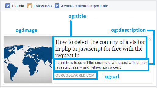
OG (Open Graph) 란? 대부분의 콘텐츠는 URL로 공유되는데 콘텐츠가 표시되는 방식을 관리하기 위해 오픈 그래프 태그(OG TAG)로 웹사이트를 마크업하여 마케팅 효과를 낼 수 있다. 즉, 해당 콘텐츠의 요약내용이 "SNS에 게시되는데 최적화된 데이터"를 가지고 갈 수 있도록 설정하는 것으로 미리보기 화면 생성을 통해 미리보기가 가능한 정보를 노출해준다. 오픈그래프(OG, 오픈 그래프 프로토콜)는 어떤 HTML 문서의 메타정보를 쉽게 표시하기 위해서 메타정보에 해당하는 제목, 설명, 문서의 타입, 대표 URL 등 다양한 요소들에 대해서 사람들이 통일해서 쓸 수 있도록 정의해놓은 프로토콜이며, 페이스북에 의하여 기존의 다양한 메타 데이터 표기 방법을 참조하여 만들어졌다. 그 간편함으로 인해 현재는 그 창시자인 페이스북은 물론이고, 네이버 블로그, 카카오톡 등에서도 널리 사용하고 있다.
Open Graph형식에 의거해 사이트가 공유될때 아래와 같은 형식으로 공유되니 참고하자.
Open Graph와는 달리 트위터에 사이트가 공유될때는 아래와 같은 형식으로 공유되니 참고하자.
여기까지 작성 후 css 폴더와 js 폴더를 만든 후 css 폴더 內 style.css 파일을 하나 생성한 후 아래와 같이 작성한다.
*{box-sizing:border-box;}/* 동일한 사이즈의 box를 만드는 경우에도 border나 padding의 값이 달라 box size가 달라지는 경우가 많기에*//* 아예 초기값으로 box size를 border까지 모두 포 함한 border-box로 세팅한다.*//* *은 전체를 나타냄 *//*body 전체에 적용 될 기본 폰트 */body{font-family:"Spoqa Han Sans Neo","Sans-serif";}
모든 홈페이지는 가로가 일정 사이즈 이상이면 가운데에 특정한 사이즈로 표시되도록 해야 하고 수평정렬을 위해 flex 옵션을 사용해야 한다. 헤드 부분을 아래와 같이 보이기 위해 코딩을 진행한다.
body 내 header 영역 구성
<body><header><divclass="inner"><divclass="head-container"><div>Gibson's git</div><div>Gibson's blog</div></div></div></header><!-- 한 라인씩 내용을 넣을 예정 --><section></section><!-- footer 를 넣을 예정--><footer></footer><!-- <script src="js/main.js"></script> --></body>
CSS class naming (BEM 명명규칙: Block Element Modifier 순으로 작성)
1. __ : ~ 의 하위 요소를(속해있는) 나타냄
2. -- : ~ 의 상태를 나타냄(수정한다 라는 느낌)
3. - : 단어와 단어사이는 하이픈 (blue-box)
※ 예를 들어, box-container__title--blue 와 같이 작성할 수 있음 (참고)
header 에 상단 메뉴까지 넣을 예정으로 전체 layout 는 시멘틱 태그로 구성하고,
각 layout component 는 width를 100% 로 하되, 해당 component 에 들어가는 요소들은
특정 가로 사이즈 이상에서는 특정 사이즈로 가운데에 정렬되도록 inner 클래스로 감쌈
각 하부 요소 배치를 위해서는 각 layout 별 container 로 정의해주기로 함
*{box-sizing:border-box;}body{/*body의 가로 사이즈가 커지면 모든 요소는 중앙에 위치해야 하기에 마진을 위아래는 0 그리고 좌우를 auto로 해놓는다.*/margin:0auto;color:#3f464d;font-family:"Spoqa Han Sans Neo","Sans-serif";}.inner{width:100%;/* 가로 사이즈가 1200px 넘는 해상도에서는 max-width 설정 */height:100%;/* align-items 등으로 수직 가운데 정렬을 위해, 알맞은 height 설정이 필요함 */margin:0auto;/* 가운데 정렬: 동일 요소에 width 가 설정되어 있을 때에만 적용 */padding:02rem;/* 화면을 줄일때 header의 글 항목이 너무 양쪽 끝단에 붙어있기에 패딩을 약간 줌*/}/* header 상단은 고정되어 스크롤 다운이 되더라도 아래로 내려가면 안된다. 60px 만큼 높이를 잡아준다.*//* 스크롤 처리가 안되도록 position을 fixed로 설정하고 왼쪽 최상단에 고정한다.*//* z-index값이 크면 클수록 화면이 중첩될 때 앞단에 위치한다.*/header{width:100%;height:60px;background-color:#ffffff;/*스크롤 처리가 안되도록 fixed로 설정*/position:fixed;top:0;left:0;z-index:1000;}/* 안에 있는 두개의 블럭을 수평 배열을 해야 하기에 display를 flex로 설정해야 한다.*//* 두개의 블럭이 양쪽 끝단에 고정하기 위해 justtify-content를 space-between으로 세팅한다. *//* 수직 정렬을 위해 align-items를 center로 설정한다.*/.head-container{width:100%;height:100%;display:flex;justify-content:space-between;align-items:center;}/*브라우저 사이즈가 1200px보다 커질때 안에 내용이 더이상 커지지 않고 중앙에 정렬되는 값(.inner의 max-width)을 정해준다.*/@mediaonlyscreenand(min-width:1200px){.inner{max-width:1200px;}}
헤더에 있는 두개의 텍스트에 디자인과 링크를 걸어주기 위해서는 class값의 지정이 필요하다. 여기서는 head-git과 head-blog로 정했다.
CSS 파일에 해당 항목의 스타일을 지정해주고자 하는데 일단 링크를 걸어주는 a태그에 해당하는 default값을 없애주는 것이 필요하다. a태그의 특징은 밑줄이 들어가있고 방문한 링크의 색상 또한 이쁘지 않다. 그래서 이러한 특징을 없애기 위해 초기화를 해주고 글자 위에 올라가면(hover) 글자색이 변경되게 해준다.
/* a 링크 태그 스타일을 초기화한다.*/a{all:unset;}a:link{text-decoration:none;color:#3f464d;}a:visited{text-decoration:none;color:#3f464d;}a:active{text-decoration:none;color:#3f464d;}a:hover{text-decoration:none;color:#3f464d;}.head-container.head-git{font-weight:bold;font-size:1.2rem;}.head-container.head-gita:hover{color:#2186c4;cursor:pointer;}.head-container.head-blog{font-weight:bold;font-size:1.2rem;}.head-container.head-bloga:hover{color:#2186c4;cursor:pointer;}
index.html과 style.css를 모두 적용하면 아래와 같은 화면을 볼 수 있다.
주석을 모두 제외한 index.html
<!DOCTYPE html><htmllang="ko"><head><metacharset="utf-8"/><title>반응형 홈페이지 만들기 01</title><metaname="description"content="반응형 페이지"/><metaname="keywords"content="homepage, 홈페이지, 반응형, 따라하기"/><metaname="author"content="Gibson Kim"/><metaname="viewport"content="width=device-width, user-scalable=no, initial-scale=1.0, maximum-scale=1.0, minimum-scale=1.0"/><metahttp-equiv="X-UA-Compatible"content="ie=edge"/><metaproperty="og:type"content="website"/><metaproperty="og:title"content="반응형페이지 만들기"/><metaproperty="og:description"content="반응형 페이지 만드는 법 무작정 따라하기"/><metaproperty="og:image"content="https://gibson1211.github.io/assets/images/gibson_logo_square.jpg"/><metaproperty="og:url"content="https://gibson1211.github.io/"/><metaproperty="og:site_name"content="Gibson's Blog"/><metaname="twitter:card"content="summary"/><!-- card 종류: summary, photo, player --><metaname="twitter:title"content="반응형페이지 만들기"/><metaname="twitter:description"content="반응형 페이지 만드는 법 무작정 따라하기"/><metaname="twitter:image"content="https://gibson1211.github.io/assets/images/gibson_logo_square.jpg"/><metaname="twitter:url"content="https://gibson1211.github.io/"/><metaname="twitter:creator"content="Gibson Kim"/><linkrel="icon"href="https://github.com/Gibson1211/Gibson1211.github.io/blob/master/assets/images/favicon.ico"/><linkrel="apple-touch-icon"href="https://github.com/Gibson1211/Gibson1211.github.io/blob/master/assets/images/favicon.ico"/><linkrel="shortcut icon"tyle="image/x-icon"href="https://github.com/Gibson1211/Gibson1211.github.io/blob/master/assets/images/favicon.ico"/><linkrel="stylesheet"href="https://cdnjs.cloudflare.com/ajax/libs/normalize/8.0.1/normalize.min.css"/><script src="https://kit.fontawesome.com/800f427ff4.js"crossorigin="anonymous"></script><linkhref="//spoqa.github.io/spoqa-han-sans/css/SpoqaHanSansNeo.css"rel="stylesheet"type="text/css"/><linkrel="stylesheet"href="css/style.css"/></head><body><h1>반응형 홈페이지 무작정 따라하기</h1><header><divclass="inner"><divclass="head-container"><divclass="head-git"><ahref="https://github.com/Gibson1211">Gibson's git</a></div><divclass="head-blog"><ahref="https://gibson1211.github.io/">Gibson's blog</a></div></div></div></header></body></html>
주석을 모두 제외한 style.css
*{box-sizing:border-box;}body{margin:0auto;color:#3f464d;font-family:"Spoqa Han Sans Neo","Sans-serif";}a{all:unset;}a:link{text-decoration:none;color:#3f464d;}a:visited{text-decoration:none;color:#3f464d;}a:active{text-decoration:none;color:#3f464d;}a:hover{text-decoration:none;color:#3f464d;}.inner{width:100%;height:100%;margin:0auto;}header{width:100%;height:60px;background-color:#ffffff;position:fixed;top:0;left:0;z-index:1000;}.head-container{width:100%;height:100%;display:flex;justify-content:space-between;align-items:center;}.head-container.head-git{font-weight:bold;font-size:1.2rem;}.head-container.head-gita:hover{color:#2186c4;cursor:pointer;}.head-container.head-blog{font-weight:bold;font-size:1.2rem;}.head-container.head-bloga:hover{color:#2186c4;cursor:pointer;}@mediaonlyscreenand(min-width:1200px){.inner{max-width:1200px;}}


댓글남기기